Top 20 project management charts to visualize project progress


Summary
Whether or not it’s your job title, being a project manager means finding ways to execute work more effectively. For teams engaged in sprints or iterative work, visualizing tasks can help streamline communication and create transparency.
Project management charts assist in problem solving by helping team members visualize tasks and understand how that work connects to larger business goals. From Gantt charts to flowcharts, there are a lot of different types of charts to choose from. These can include charts for planning and resourcing such as Gantt charts, WBS, and CPM, executing such as Kanban and timelines, and reporting such as a bar chart and burndown chart.
We’ve put together 20 of the most effective project management charts in each of these categories and outlined how each can benefit your team and help you achieve your goals.
Master AI-Powered Workflow Optimization
Ready to revolutionize your team's productivity with AI you can trust? Join industry leaders from Asana and Anthropic to learn proven strategies for implementing AI across your workflow stages and unlock the full potential of Asana's AI Studio.
Types of project management charts
Project management involves a range of tasks and responsibilities, and as such, it makes use of various chart types to meet different requirements and stages within a project. Each type of project management chart provides a distinct perspective to assist project managers in visualizing, planning, and communicating key aspects of their projects.
Choosing the best project management chart depends on factors like the project's scope, the stage of its lifecycle, and the kind of information that needs to be communicated to stakeholders.
Top project management charts for planning and resourcing
A common misconception in project management is that project charts are only useful for reporting. In fact, some of the most valuable project charts are those that help you plan projects and set your team up for success.
Using project charts for planning and resourcing can benefit your team at all levels:
Individual contributors have a clear way to visualize upcoming work.
Team leads can ensure they have enough resources to hit their goals on time.
Stakeholders get a bird’s-eye view of the work to come, which increases engagement and buy-in.
Take a look at the top nine project management charts for planning and resourcing:
1. Gantt charts
A Gantt chart is a horizontal bar chart used to illustrate a project’s schedule by visualizing tasks over time. In this chart, each bar represents a task or initiative, and the length of the bar determines how long the task or initiative should take. Use Gantt charts to visualize the timeline, tasks, and goals within a given project.
While not the original inventor, Gantt charts became popular thanks to Henry Gantt in the 1910s. Gantt charts have come a long way since their original use of logging factory hours. Today, they’re used to track real-time project progress, visualize task dependencies, and represent important milestones.
Best for: Teams looking to visually map out their project plan so they can coordinate dependent tasks and hit their deadlines on time. Gantt charts are helpful for planning and scheduling projects from start to finish.
![[Product UI] Brand campaign project in Asana, Gantt chart-style view (Timeline)](https://assets.asana.biz/transform/10e77bb8-a116-4169-83d5-d4d644824c54/inline-gantt-chart-basics-1-2x?io=transform:fill,width:2560&format=webp)
2. Work breakdown structures (WBS)
A work breakdown structure is a method used to visually break down project activities into smaller units. You and your project team can use a WBS to visualize required deliverables and dependencies while streamlining communication.
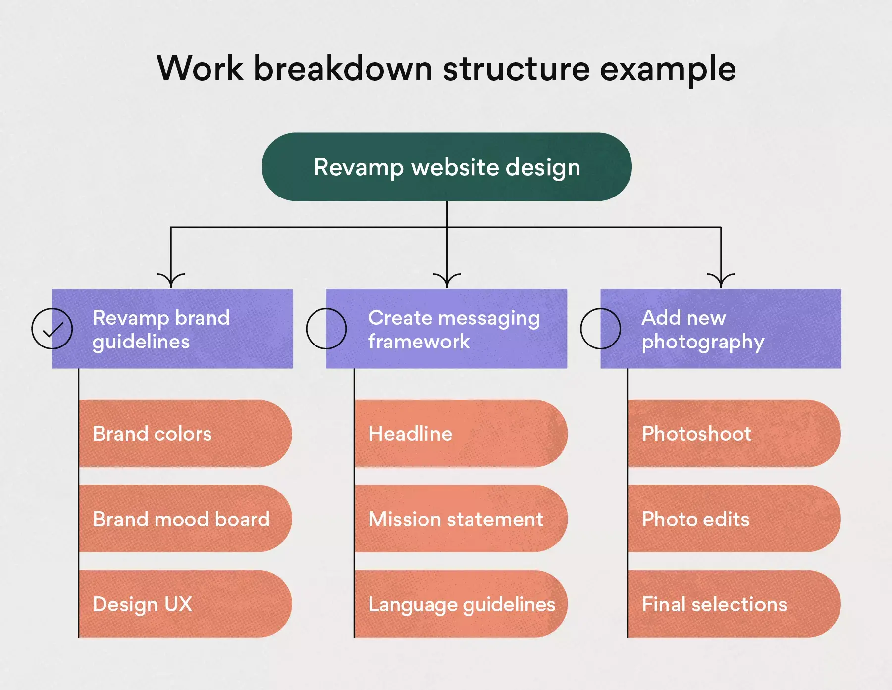
There are three levels within a WBS, which include parent tasks, dependencies, and sub-dependencies. These levels break tasks down into their simplest form, showing the work required to complete the parent task. Try a work breakdown structure template to put this framework into action on your next complex project.
Best for: Teams working on complex projects looking to break down tasks into small pieces. A WBS helps to visualize dependencies, connecting tasks to larger goals.
3. Critical path method (CPM)
A critical path is the longest sequence of activities your team needs to finish on time in order for the entire project to be complete. The critical path method is a technique used to identify the amount of time each of these activities requires.
Since delays in critical tasks can affect the entire project, the critical path method helps to facilitate better resource allocation and avoid bottlenecks. Once you identify the critical path, you can schedule tasks with enough time to ensure your team can complete the project deliverables on schedule.
Best for: Teams looking to complete a project in the most efficient timeline possible. This type of project management chart helps to schedule deliverables and project due dates.
4. PERT charts
PERT stands for Program Evaluation and Review Technique. A PERT chart is a tool used to schedule, organize, and map out tasks within a project. You can use it to gain a visual representation of a project's timeline that breaks down individual tasks.
The purpose of a PERT chart is to better understand how to connect tasks to one another, giving a clear visual of dependencies. You can use this project management chart chart to evaluate required resources and estimate task duration and team allocation.
Best for: Teams working on a project with complex sub-dependencies. A PERT chart helps to accurately allocate resources, keeping deadlines on track.
5. Flowcharts
A flowchart is a diagram that illustrates the steps, sequences, and decisions of a workflow. You can use a flowchart to plan, visualize, and document important steps in a process.
A flowchart may incorporate different visualization tools such as a PERT chart or swimlane diagram. You can use a flowchart for a variety of purposes, including to simplify complex workflows, organize tasks, and identify bottlenecks.
Best for: Teams who struggle to solve bottlenecks and keep tasks organized. A flowchart makes it easy to visualize project issues and solutions.
6. Network diagrams
A network diagram consists of boxes and arrows to depict tasks and visualize whether they are critical or not. It is one of many resource leveling tools used to adjust project dates and gauge available resources.
Use a network diagram to map the chronology and schedule of project tasks. Plan the duration of projects and track progress along the way with the help of a network diagram.
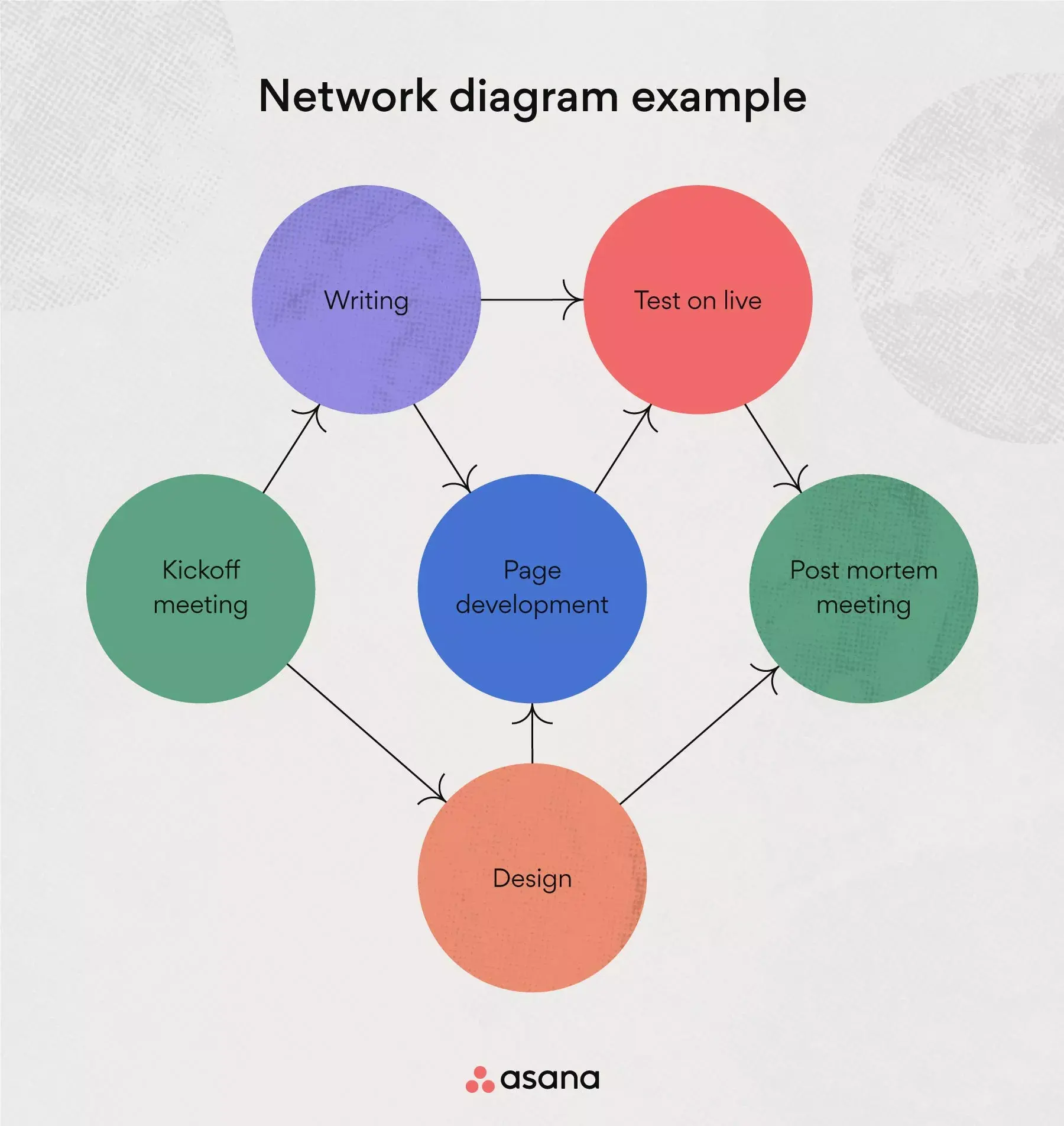
Best for: Teams who struggle to keep projects on track and prioritize deliverables. A network diagram helps to prioritize critical tasks.
7. Matrix diagrams
A matrix diagram helps you understand the relationship between data sets, functions, and project elements. You can use this diagram to identify problems, allocate resources, and assess areas of opportunity within a project.
There are a variety of different matrix diagrams that include L-shaped, Y-shaped, C-shaped, T-shaped, and X-shaped. Analyze the goal and data points of your project to determine the right diagram for your team.
Best for: Teams who work on data-focused projects and need help connecting tasks to goals. A matrix diagram helps your team understand the relationship between data and goals.
8. Cause and effect chart
The cause-and-effect chart is instrumental in brainstorming sessions, particularly when teams are identifying and dissecting potential causes of a specific problem or issue within a project. This project management chart helps identify underlying factors that may not be immediately apparent.
Cause-and-effect charts let team members conduct in-depth analysis by visually highlighting project variables and their potential effects. It's a useful tool for breaking complicated problems into more manageable parts, enabling a rigorous look at each component and how it affects the project.
Best for: Teams that are dealing with complex problems, especially in projects where pinpointing and understanding root causes are critical for successful resolutions and project success.
9. SWOT analysis chart
A SWOT analysis chart assesses a project's strengths, weaknesses, opportunities, and threats. When working on agile projects, this kind of overview is especially important for coming up with good strategies and smart choices.
This project management chart enables teams to align their objectives with internal strengths and weaknesses, as well as external opportunities and threats. This helps them understand their position in the face of project challenges and changes in the market.
Best for: Agile teams looking to adapt and pivot their strategies in response to changing project dynamics and external factors.
Project management charts best for executing
Once you’ve finished the planning process, use project charts to execute your work. Track exactly who’s doing what, by when, and why. Keep your team on track with a central source of information and update them on any changes in real-time.
Let’s take a look at the six best project management charts for executing work:
10. Kanban boards
Kanban boards are a way to visualize work that needs to get done, especially as work moves through stages. You may have seen these created out of sticky notes or on a whiteboard.
Virtual Kanban board tools are more dynamic task management tools—they allow you to track the progress of work across different stages in real time. While these stages vary from team to team, yours may include New, Ready, In Progress, Drafting, Hold, and Complete.
Best for: Teams that embrace continuous improvement and prefer to work in successive stages with clear deliverables. This project management chart helps to visualize the stages within a project.
![[Product UI] Brand campaign Kanban board in Asana (Boards)](https://assets.asana.biz/transform/0bf24409-8788-4d08-a745-84550c9502a2/inline-generic-boards-2x?io=transform:fill,width:2560&format=webp)
11. Pareto charts
The Pareto principle states that roughly 80% of consequences come from 20% of causes. Use a Pareto chart to visualize project tasks based on this 80/20 rule. It’s an excellent data visualization tool that typically combines elements of a bar graph and a line graph, where individual tasks are represented as bars on the vertical axis and their cumulative impact is shown by a line graph on the horizontal axis.
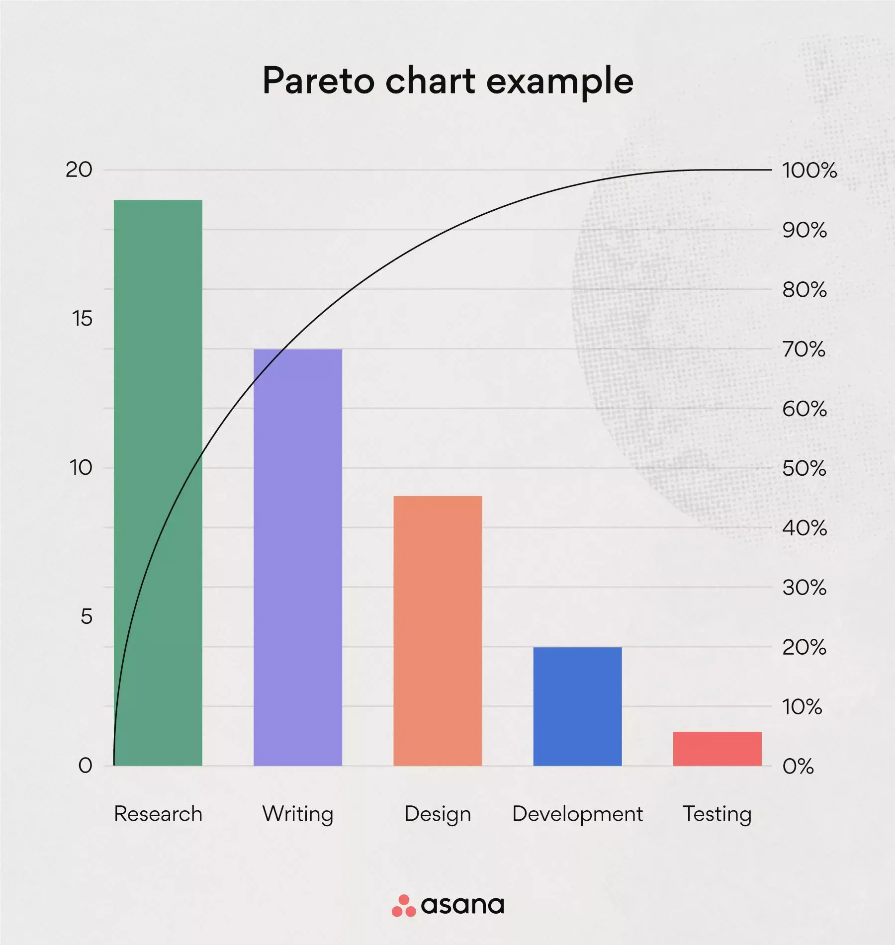
You can use this type of project management chart to identify priorities and make the best decisions for your team. Consider which tasks will have the biggest impact with just 20% of your team’s time. This will help align smaller tasks with larger goals and give your team clear direction.
Best for: Teams who have a heavy workload and need help prioritizing projects. A Pareto chart helps to organize tasks by priority, so you can make the biggest impact.
12. RACI Chart
By outlining roles and duties within project teams, the RACI chart encourages accountability and openness. It categorizes each team member as responsible, accountable, consulted, or informed for every task. By outlining job ownership, a RACI chart makes sure each team member is aware of their individual responsibilities and the demands made of them.
This project management chart is particularly effective in minimizing misunderstandings and ensuring that all stakeholders are on the same page throughout the project lifecycle.
Best for: Multi-stakeholder projects benefit from this approach because it simplifies communication, clarifies roles and responsibilities, and lowers the possibility of duplicate or overlooked tasks.
13. Project timelines
A project timeline helps you stay on track so you can hit your deadlines. Map out project progress and connect smaller tasks to larger business goals with a project timeline.
To get started, create a project timeline by listing out your to-dos, estimating the duration of each initiative, and mapping out dependencies. Once your timeline is in place, share it with all of your project stakeholders so they have real-time insight into your initiatives and deadlines, as well as any changes you make along the way.
Best for: Teams looking to stay on track with tight deadlines. Project timelines help visualize the work needed to reach goals.
14. Fishbone diagrams
Use a fishbone (Ishikawa) diagram to represent issues or bottlenecks within a project. This type of diagram is also commonly referred to as a cause-and-effect chart. In a fishbone diagram, the head of the fish represents the issue or bottleneck you’re trying to resolve, while the ribs represent different categories and associated tasks.
You can use a fishbone diagram to solve solutions for root cause issues with the help of your team members. Examples of issues include a lack of resources and incorrect project data.
Best for: Teams who struggle to solve project issues in real time. The fishbone diagram helps connect issues to potential solutions so you can identify the next best steps.
15. Control charts
A control chart is a way to visualize project changes. You can use a control chart to understand how long tasks take to complete compared to the allocated resources. This will give you a true picture of the project’s progress over time.
To create a control chart, start by determining an upper and lower limit—such as task duration or number of resources—to represent set milestones. Erratic changes that exceed these limits symbolize drastic fluctuations. Once you identify those fluctuations with your control chart, you can quickly address and resolve them.
Best for: Teams that struggle with solving issues that derail or postpone projects. This type of project management chart helps you stay on track with allotted resources.
Project management charts to use for reporting
A critical—but sometimes overlooked—part of project management is reporting on work once it’s finished. It’s amazing if you’re able to hit your project goals, but without a way to report on your work, your team can’t learn from your successes—or mistakes.
Effective project charts for reporting give you an opportunity to learn valuable lessons from your project and apply those lessons moving forward.
To get started, check out these five types of project management charts for reporting:
16. Bar charts
A bar chart is a traditional approach to visualizing project data. The purpose of a bar chart is to measure project variables based on milestones. With its simple format and versatile components, it’s no wonder so many teams use bar charts.
You can create a bar chart by plotting the variables of your choosing, such as task hours or project cost, on the X and Y axes. This design allows you to quickly digest project data and share it with key stakeholders.
While you can create bar charts by hand, the best way to generate this type of chart is to create it with a universal reporting tool. When your bar chart is directly connected to your team's work, you can reduce manual work and duplicative tasks and dedicate more time to high-impact initiatives.
Best for: Teams looking for a simple way to visualize project components. A bar chart helps to analyze various project variables against goals
![[Product UI] Universal reporting interactive dashboards in Asana (Search & Reporting)](https://assets.asana.biz/transform/4a845a7b-5c6d-4e87-9968-4f67d30e46da/TG23-web-hero-039-optimization-project-goals2-static-2x?io=transform:fill,width:2560&format=webp)
17. Burndown charts
A burndown chart is a visual representation of the remaining work vs. the time required to complete it. You can use a burndown chart to estimate task duration, analyze issues, and determine your project completion date.
The purpose of this project management chart is to accurately plan for future resources based on data. To create a burndown chart, plot the estimated task duration against the actual time on the chart. This will give you a visualization of the ideal vs. actual work duration.
Best for: Teams looking to analyze the estimated work time vs. the actual. A burndown chart helps to determine project due dates.
18. Burn up charts
A burn up chart differs from a burndown chart in that it represents the amount of work left to complete, rather than the duration. In short, it tracks project progress as opposed to time.
To create a burn up chart, plot the ideal tasks remaining against the actual number of tasks remaining. This will give you a clear understanding of where you need additional resources. You can use both a burndown chart and a burn up chart together to understand the full picture of team efficiency.
Best for: Teams looking to analyze the estimated vs. actual amount of work. A burn up chart helps determine resource allocation.
19. Pie charts
A pie chart is a traditional design similar to a bar chart, though it differs in visual layout. A pie chart breaks down different components within a project. For example, if you anticipate the research phase to account for 10% of the project and it exceeds 20%, you know where to begin analyzing areas for improvement.
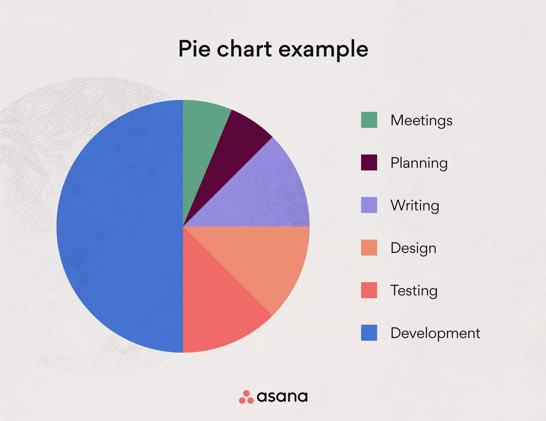
You can use a pie chart to track significant components within a large project to better understand resource allocation and important metrics and insights.
Best for: Teams looking to understand the breakdown of a given project. This project management chart helps your team visualize multiple components against each other to determine where you’re spending the most time or resources.
20. Status report chart
The status report chart, also referred to as a dashboard, offers detailed updates and overviews of a project's progress. By integrating timeline views and data visualization, a status report chart provides a clear and concise representation of the project's current status, milestones, and potential challenges.
This comprehensive project management chart serves as a visual summary, showing key aspects such as progress, resource allocation, budget status, and upcoming deadlines. It's a valuable tool for keeping stakeholders informed and engaged while also facilitating data-driven decision-making processes.
Best for: projects that need to keep stakeholders up to date on progress and status on a regular basis.
Advantages of project management charts
Effective project management is key to the success of any venture, large or small. You can improve the effectiveness and clarity of your project planning and execution by implementing different types of project management charts. These charts are not just tools for organizations; they are vital in steering a project towards success. Here are some of the key advantages:
Visualization of complex data. Project management charts turn complex project data into clear, digestible visual formats. For all team members to comprehend and interact with the information, this simplification is essential. It will enable better decision-making and a successful project conclusion.
Improved project planning: Project management charts are indispensable in creating detailed plans and schedules. They provide a roadmap for the project, highlighting key milestones and deadlines, which are essential for keeping the project on track and ensuring timely completion.
Streamlined team communication: One of the biggest challenges in any project is maintaining clear and consistent communication. Charts offer a visual representation of project status and updates, making it easier for team members to stay informed and aligned.
Tracking and reporting progress: Monitoring the ongoing progress of a project is important. Project management charts provide a visual tool for tracking development against planned objectives and make it easier to report on the project's status to stakeholders and make adjustments as needed.
Visualize your work and increase clarity
A project management chart can help your team better digest project information through simple visuals. This can help you streamline project planning by setting clear expectations up front.
While there are many different types of project charts to choose from, project management software makes building diagrams easy. From shuffling between projects and tasks to keeping feedback and team communication in one place, a project management tool can help you accomplish your goals.
Report across teams and projects with Asana